
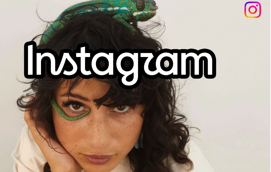

The new Instagram logo has a cleaner look after almost 10 years, but some users think the name now looks like “Instagzam”.
CALIFORNIA: Instagram has changed the way its name looks for the first time in almost a decade, and people online are already having fun with it. The social media platform has introduced a cleaner and simpler wordmark, but some users say the new lettering is actually harder to read. Their verdict? It looks more like “Instagzam” than Instagram.
Instagram head Adam Mosseri revealed the new design on Thursday, August 13, calling it “cleaner and more modern”. However, Instagram is not changing everything. The famous pink, orange and purple camera icon that appears on millions of phones will stay the same. The update only changes the handwritten Instagram name used across the company’s branding.
So, what actually looks different? The old Instagram name had flowing cursive letters that were closely connected. The new version gives each letter a little more space and looks like a mix of handwriting and a regular font. Instagram has kept some of the curves and handwritten details so that the name still feels familiar, but the overall design is much simpler.
Of course, changing something that millions of people recognise was always going to get a reaction. Some users like the cleaner look, while others are struggling to read it. The unusual shape of some letters has led to jokes that the new Instagram logo says “Instagzam”. It is the kind of small design change that might have gone unnoticed elsewhere, but on social media, even changing a few letters can quickly become a talking point.
This is not the first time Instagram has faced mixed reactions over a new look. In 2016, the platform dropped its old retro camera icon and replaced it with the colourful gradient camera logo we know today. Many people disliked it at first, but over time it became one of the most recognisable app icons around the world. Instagram made more changes in 2022 when it introduced its own Instagram Sans font and gave its famous gradient brighter colours.
Instagram has revealed a new wordmark logo
— CharlieIntel (@charlieINTEL) August 13, 2026
Left: Old, Right: New pic.twitter.com/06hUfWuRVe
The new Instagram logo also comes at a time when the platform itself has changed a lot. Instagram started mainly as a place to share square photos, but today people use it for Reels, Stories, messages, shopping and much more. The company appears to want its branding to feel more modern as the platform continues to grow.
the head of instagram just posted a new wordmark after 10 years of it being unchanged. pic.twitter.com/FLjSOkwrpO
— Cait Cavell (@Cait_Cavell) August 13, 2026
Nothing about how the app works is changing, so users do not need to do anything. But Instagram’s new look will gradually start appearing across its branding. Whether people eventually get used to it, as they did with the 2016 icon, remains to be seen. Until then, “Instagzam” may continue getting a few laughs online.
News Impact
The change will not affect how Instagram works, but users will start seeing the new wordmark across the platform and its branding. More importantly, the reaction shows how even a tiny change to a famous app can quickly become a big conversation online.